There’s no way around it—identity is complicated. And identity governance solutions don’t exactly have a reputation for making it simpler.
So we’ve challenged ourselves from the start to build a platform that embraces identity’s complexity while abstracting it as much as possible. ConductorOne is designed to be highly opinionated in some aspects and highly configurable in others, to streamline identity governance workflows while remaining flexible enough to adapt to any kind of environment.
That design philosophy extends from how we ingest and orchestrate data all the way to the end user experience in the product. We all know products that are hard or annoying to use won’t be used successfully, if they’re used at all. So creating a simple, intuitive user experience has been a core product goal from day one.
But it’s one thing to deliver on an initial design vision. It’s another thing entirely to keep that vision in focus as a platform scales. As we’ve added more and deeper capabilities to ConductorOne, our product designers and software engineers have had the paradoxical mandate of making the user experience even simpler. It’s their job to understand and predict all the ways identity can get complicated—so our users don’t have to.
Not an easy task. But our team loves the challenge. I talked to them recently about their approach to designing, and redesigning, ConductorOne’s UI and overall user experience “as the plane is flying” so to speak, and to get an update on our latest UI changes.
Proactive design thinking
ConductorOne is growing fast—aggressively releasing new capabilities and serving more and larger customers who have a lot of data and users. Without thoughtful product design, that pace of change could quickly result in cluttered navigation menus, hard-to-parse dashboards, and a product experience that changes from one feature to the next. So our UI designers and engineers are always thinking a step ahead.
“All of our changes fall into a couple of buckets,” says UI Software Architect Santhosh Kumar Bala Krishnan, “simplifying stuff and keeping things consistent.”
Simplifying means decreasing the number of steps and clicks a user has to perform to get a particular task done, and making it easy to find and view information. For example, adding bulk actions and redesigning tables to surface more information have made the product easier to use even as the number and types of tasks being performed have increased.
Creating consistency means standardizing UI elements and workflow steps across the platform, to reduce the cognitive load on users as they move around—ideally the product feels natural and intuitive to navigate, whether a user is performing a familiar or brand new task.
“We have a complex app,” says Morgan Hung, ConductorOne’s Senior Product Designer. “We don’t try to hide that our product has a lot of features and functionality, but we try to make it as easy as possible for the user to move through things.”
Sometimes design choices are made for functionality over aesthetics. The team recently changed how users view connectors from a tile grid to a list view: “Three years ago, we had a smaller set of connectors, so the tile grid worked well and looked nice,” says Gowthami Dommety, Staff Software Engineer. “But we’ve added so many connectors in such a short time that we had to update the design.”
Designing for all users
The team has to decide when to make small adjustments and when to fully redesign a particular element, like a menu, task view, or workflow. “Scaling can be hard,” Morgan says, “because once we get to a certain point, we can’t Frankenstein the product. We need to rethink the whole thing.”
The team carefully plans larger changes. They make sure they have a good understanding of the problem they’re solving for and how users are interacting with the current design. “Then we are at a good place where we feel confident about scaling,” says Software Engineer Magizh Thirunavukkarasu.
“The process includes designers and content designers sitting in on customer meetings,” Morgan says. “We information-gather and implement a lot of customer feedback.”
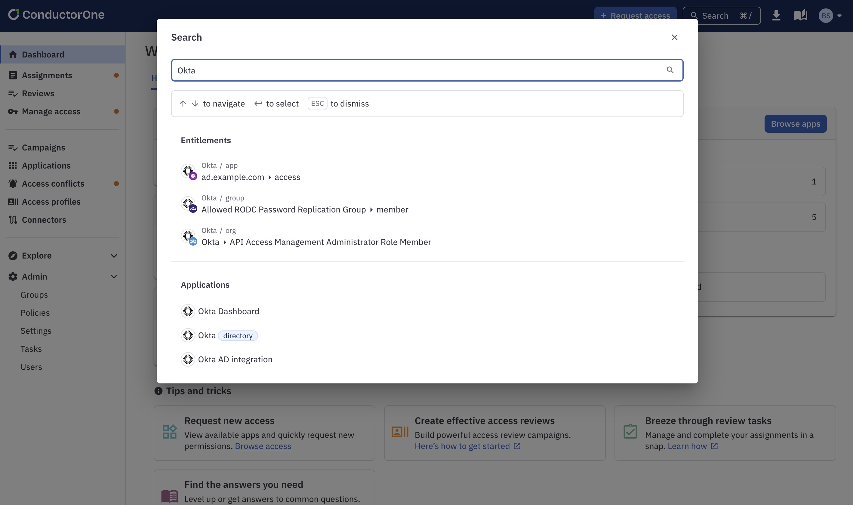
“While we are developing, we also think about how we would want to use the product,” adds Gowthami. For example, for power users who prefer to do most things on their keyboard, the team added the ability to search and go directly to something in the product, so users could skip past the clicks normally involved.

In addition, the team must create a seamless experience across multiple interfaces. “The web app is not the only client,” says Matt Kaniaris, Software Engineer, “and it’s not even necessarily the most important client for a lot of our users. Some are explicitly in Terraform.”
ConductorOne writes our own Terraform provider, so we have control over some parts of that user experience. But the overlap between what works well in Terraform, in the web app, and other ways users interact with the product, including via Slack, complicates the design process. Close collaboration between the product and engineering teams is critical to landing on successful solutions that improve the UI for all users—from engineers using CLI to app owners approving access requests right in Slack.
Designing behind the scenes
Creating a great frontend experience often means doing a lot of backend work that users never see. “With other products, you just make an API call and get back a response and that’s it,” says Santhosh. “ConductorOne is different—a lot of tasks happen async, which creates a UI challenge.”
“Not only are all the operations async, but we are not the source of truth,” adds Matt. “It’s a big UX challenge just to know the state of the world.” The team has worked to reduce the backend code needed to update data and started caching frontend data—changes that have made async UI updates, like loading a big table with a lot of information, frictionless for users.
Adding new behaviors across the product can also be more challenging than end users might realize. The bulk actions the team has been implementing are a good example, explains Software Engineer Alex Tebbs: “We’re expanding that functionality to more places in the product. If you see a table of things and there are actions you can perform on those things, you should be able to select them and perform those actions in bulk. But it’s actually not that straightforward to get there.” A lot of work gets done on the backend to make sure the bulk actions behave as intended.
Recent UI updates
So what’s new in ConductorOne’s UI? A lot! Here are just a few of the updates the team has worked on in the past few months:
- Simplified navigation: There’s now a top nav in addition to the main side nav, making it easier for users to find the actions and info they need.
- Improved visibility: The web app now takes better advantage of wider screens, expanding to display tables that have a lot of columns. And updates have been made to the UI elements in the entitlements view—including reversing the icon hierarchy and changing how text is truncated—to make it more readable, especially when many entitlements are listed.
- Redesigned policy-building experience: Adding or updating policy rules now happens in an editing pane, where it’s easier to see and fine-tune changes. Users have the option to construct policy rules using a custom UI control with AND/OR operators or by providing CEL code directly.
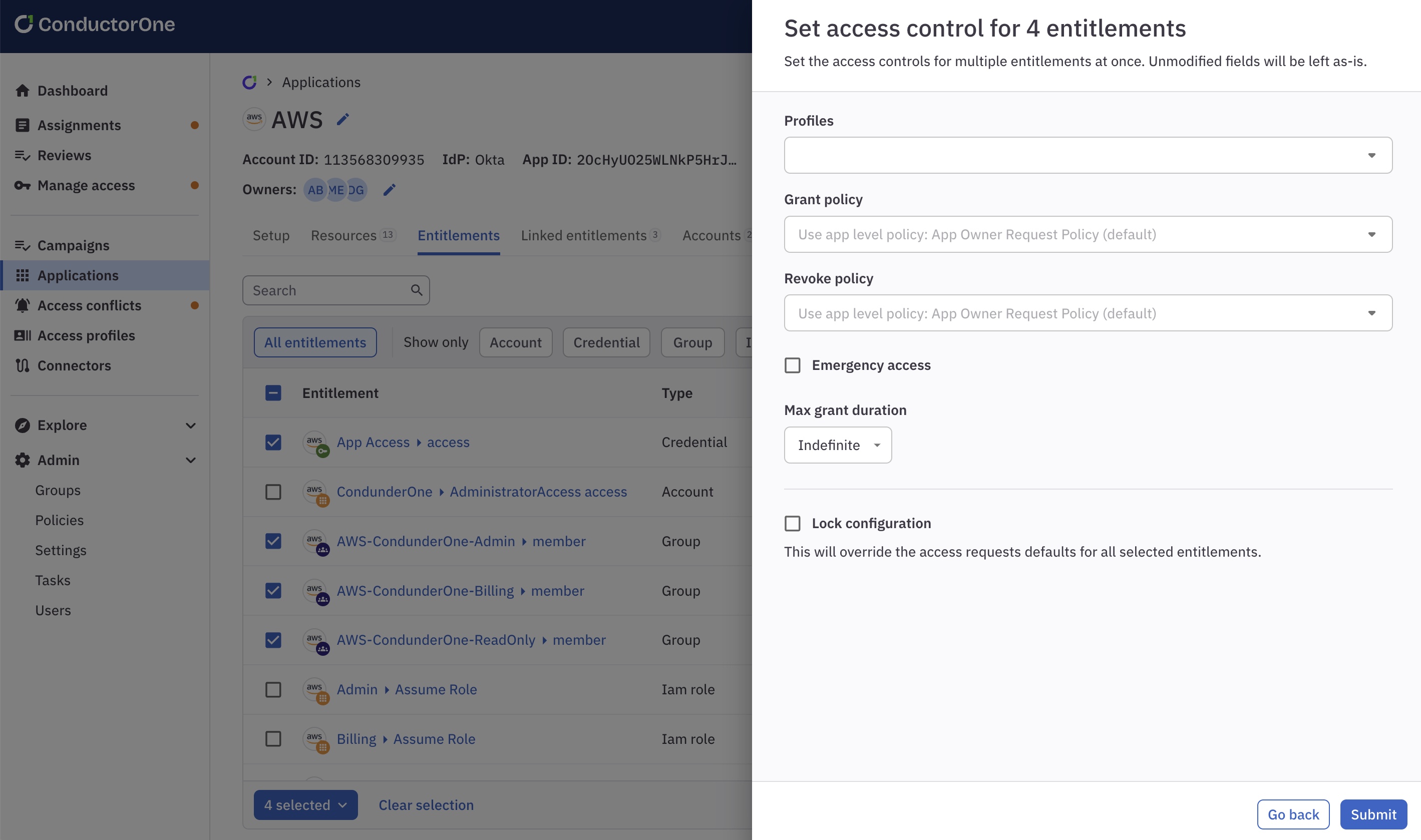
- Multiselect and bulk actions: Users can now easily update the ownership of multiple apps at once, set or update access controls on multiple entitlements at once, and take bulk actions on any sort of task, including approving/denying, reassigning, commenting, and canceling—and more bulk actions are on the way.

- More search and filter options: More tables and tabs now offer search and filtering functionality, making it much faster to find and manage info, especially in large lists.
- Consolidated task views: Users can now find all of their request, revocation, provisioning, and deprovisioning assignments on one streamlined page, and all task links across the product, regardless of type, are presented consistently so they’re simple to spot.
And more updates are always on the way! Book a demo with our team to see the latest and to learn more about how our design team partners with our customers to create the best user experience possible.


